To understand the exact nature of the problem, we conducted preliminary, exploratory research.
COMPETITIVE ANALYSIS
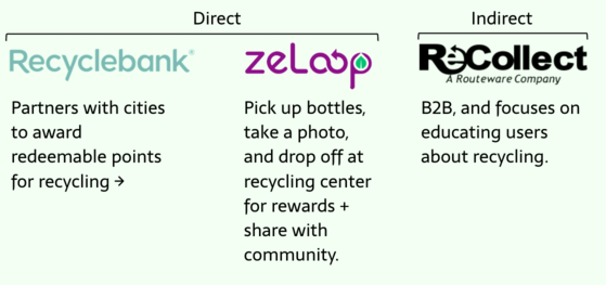
We started off by examining other technology solutions that address sustainability by looking ateight competitors.
Some questions we wanted answers to:
- What stage of the waste diversion process do products focus on?
- How are users motivated or incentivized?
- How to they engage with their community?
- How do products tackle gamification?
COMPETITIVE ANALYSIS INSIGHTS
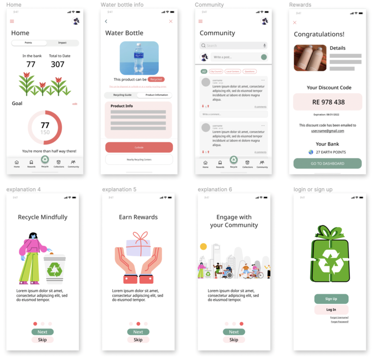
Incentivization:Action-oriented products focus on environmental impact
or rewards.
Gamification:Products are gamified using points, tokens, & leaderboards.
Personalization:Personalizations are based on users location.
Verification:Points are either self-verified or tech-verified.
INITIAL INTERVIEWS
PARTICIPANTS
- Recruitment: Personal Networks & Local Recycling Businesses
- Millenials: 22-35 years old; interested in being environmentally responsible.
- Experts: Municipality waste management officials; local eco-friendly businesses.
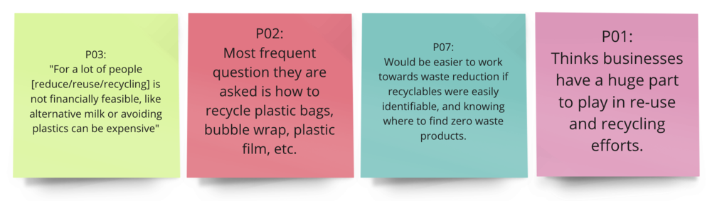
INTERVIEW INSIGHTS
There are concerns about affordability sustainable living (e.g. buying
no-waste products).
The best way to reach consumers is through working with local business &
government.
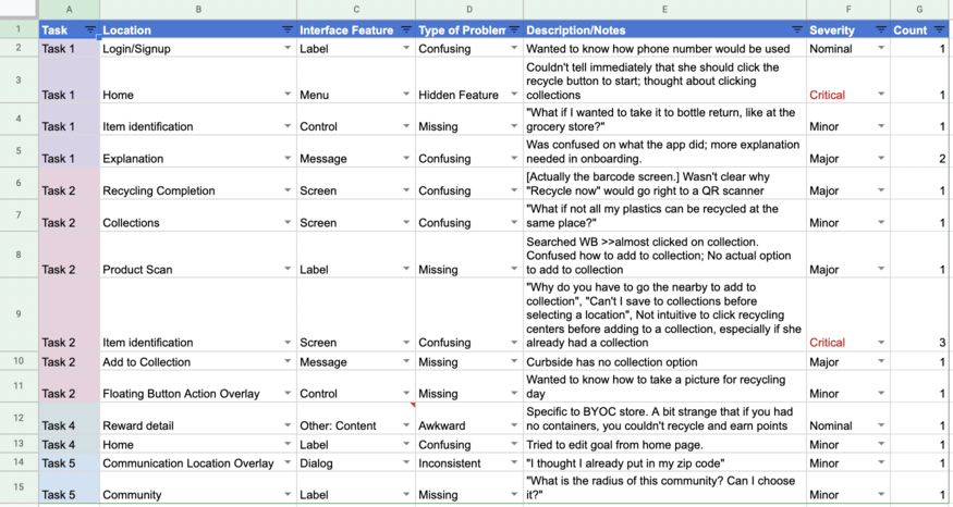
How to dispose of different types of plastics is a source of frustration.
People are motivated by (1) friends, (2) their
wallets, and (3) seeing tangible impacts, both positive &
negative.