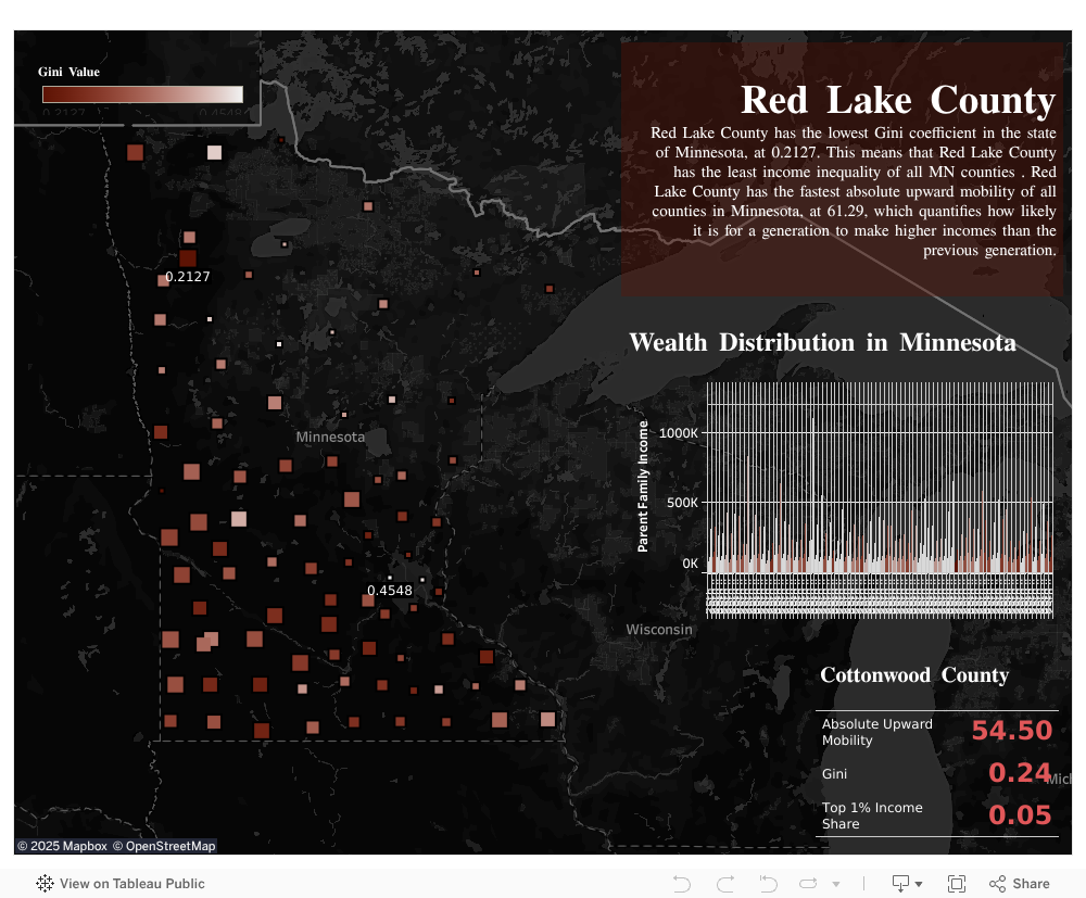
Interactive Visualization
Click the squares on the map to view each county's data.
Team:
Individual
Duration:
3 weeks
Tools:
Tableau
Adobe Illustrator
Click to View:
Github
Tableau
Project Report
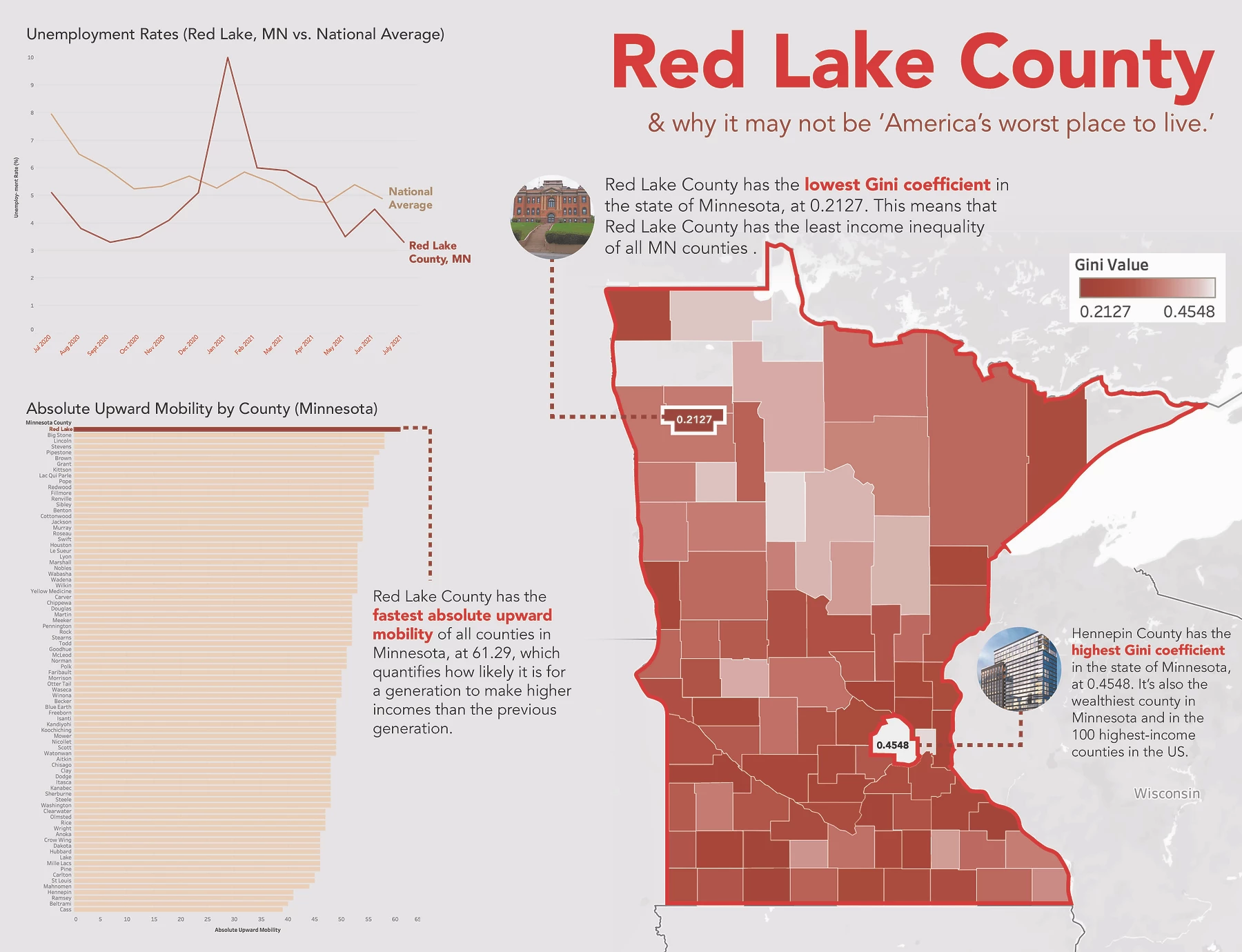
In the Washington Post article “Every county in America, ranked by scenery and climate.” journalist Chris Ingram attempts to find the absolute worst county in the country. His research led him to pinpoint Red Lake County, Minnesota at the bottom of the list.
Crazy enough, Red Lake County residents were not too happy.😱
So, they invited him to visit for himself, and to his surprise, it wasn't so bad! After his visit, he wrote another article for the Washington Post: I called this place ‘America’s worst place to live.’ Then I went there."
I did some of my own research into city and county databases, and created supporting visualizations, both interactive and static.
Click the squares on the map to view each county's data.